
Since our inception in 2017, respond.io has been at the forefront of driving conversations between you and your customers. Now, we’ve taken the next step. We’re thrilled to announce Respond 3.0—a massive revamp and redesign of the platform. Learn why we updated respond.io, what’s new and how it benefits you.

Why Are We Redesigning Respond.io?
For the last six years, we have focused on one mission: Revolutionize how businesses communicate with customers to turn every conversation into an opportunity for lasting growth. We are inspired by a vision of a world where every business is just a message away and no conversation goes unanswered.
To a great extent, we’ve succeeded. Respond.io now serves over 10,000 brands in 86 countries in multiple languages, powering customer conversations that drive revenue, customer satisfaction and business growth.
We’ve done this through three promises we make to customers: Our technology leadership, uncompromising stability and collaboration with our customers to help them grow.
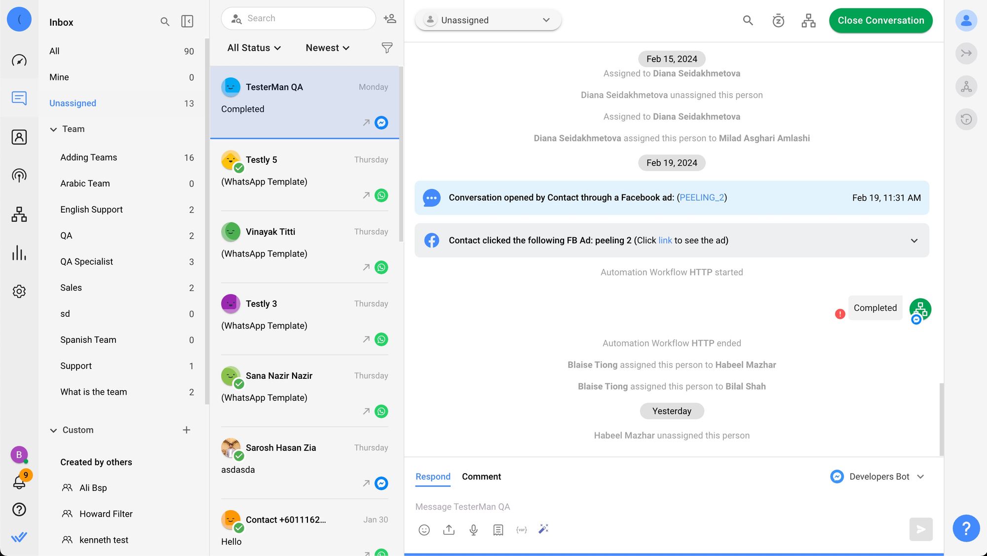
We believe the best way to create a platform is to ensure it delivers the results you want. To do this, we work with you to solve real problems and needs through channels such as our feature request board, our customer success managers and more.
Respond 3.0 was born from the conversations we’ve had and feedback we’ve gathered from you. Despite the reliability and rich features of the platform, we acknowledge the hurdles you face in using it.
First, we wanted to make our platform easier than ever to use. We already created the most powerful platform possible, and now we’re making it easy to use. Second, we’re upgrading the platform's aesthetics so that it’s even better to look at and use.
With these insights in mind, we're excited to unveil what's new in Respond 3.0.
Respond 3.0 Kicks Off With a Gorgeous User Interface
Respond 3.0 introduces a fresh look and feel that makes respond.io a pleasure to use even during long hours. Every component in this redesign is meticulously rethought to enhance your experience and efficiency.
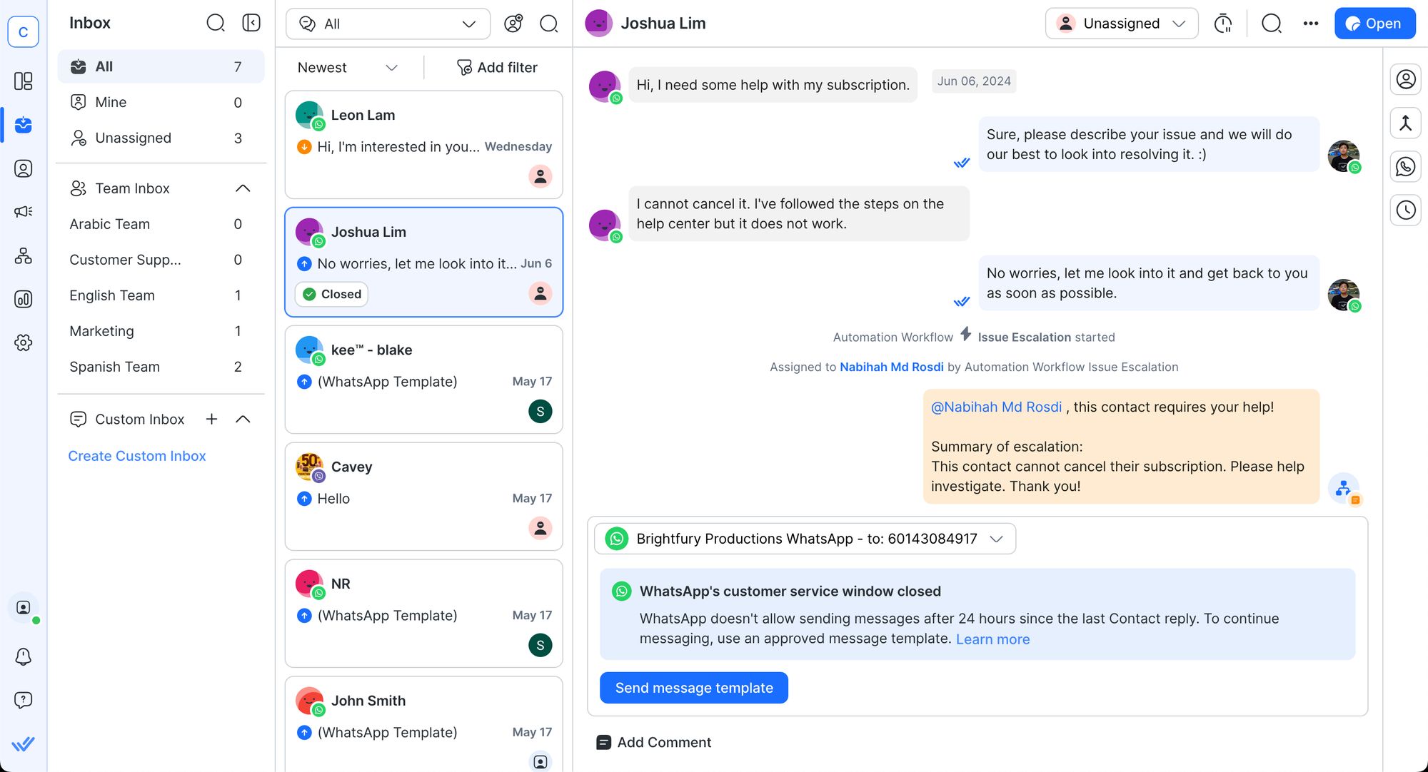
Overall, the new look and feel present a visually appealing interface. With a modern, welcoming design, it’s a joy to use.
Inbox Module: Transforming the Way You Chat
The Inbox Module, previously known as the Messages Module, has undergone significant enhancements designed to streamline your workflow and improve the efficiency of managing customer interactions. These updates are being rolled out in three stages, with each stage focusing on different aspects of the module.
In the first update, we focused on making conversation management more intuitive. A Quick Actions menu now appears when you hover over a conversation card, allowing you to manage conversations without needing to open them.
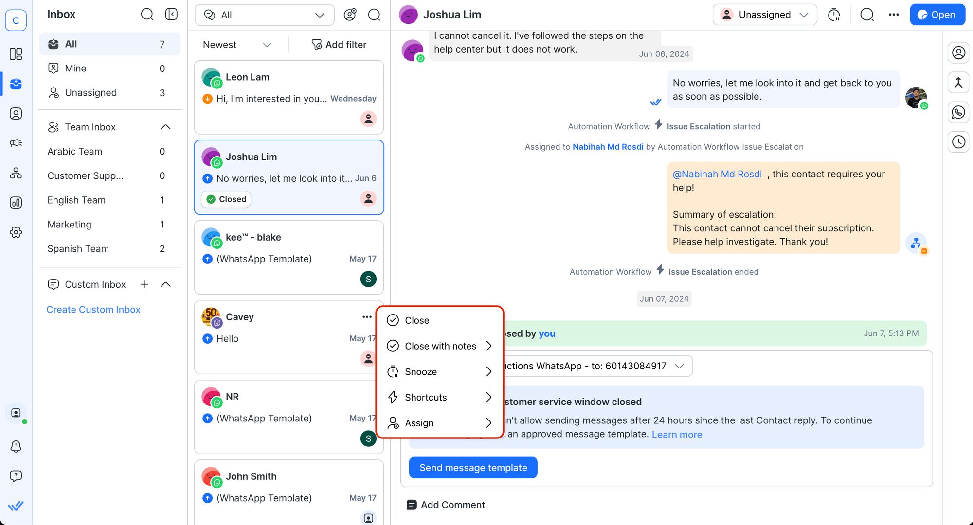
This feature reduces the number of clicks required to close, snooze, trigger Workflow shortcuts, or assign conversations, making your tasks faster and more efficient.
We’ve also enhanced the visibility of closed and snoozed labels, allowing you to easily identify the status of your conversations at a glance. The search experience has been improved with persistent search categories, making it easier to refine your search and find the conversations you need.
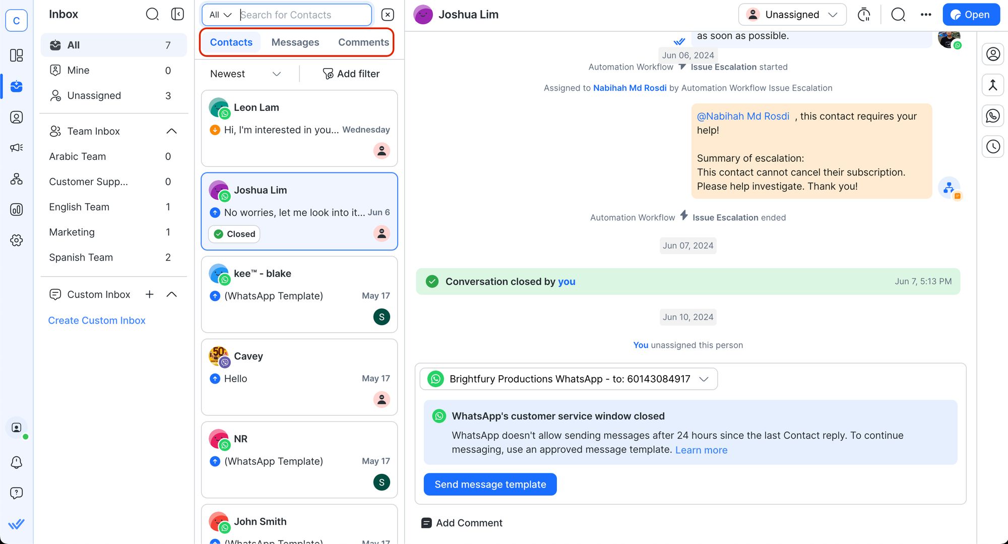
As part of our efforts to enhance your interaction speed, we’ve separated the Message and Comment Composers, ensuring clarity in communication. You can now easily distinguish between messaging a customer and leaving a comment. Additionally, we’ve reorganized the Taskbar to enhance visual clarity, with key features like the contact name now more prominently displayed.
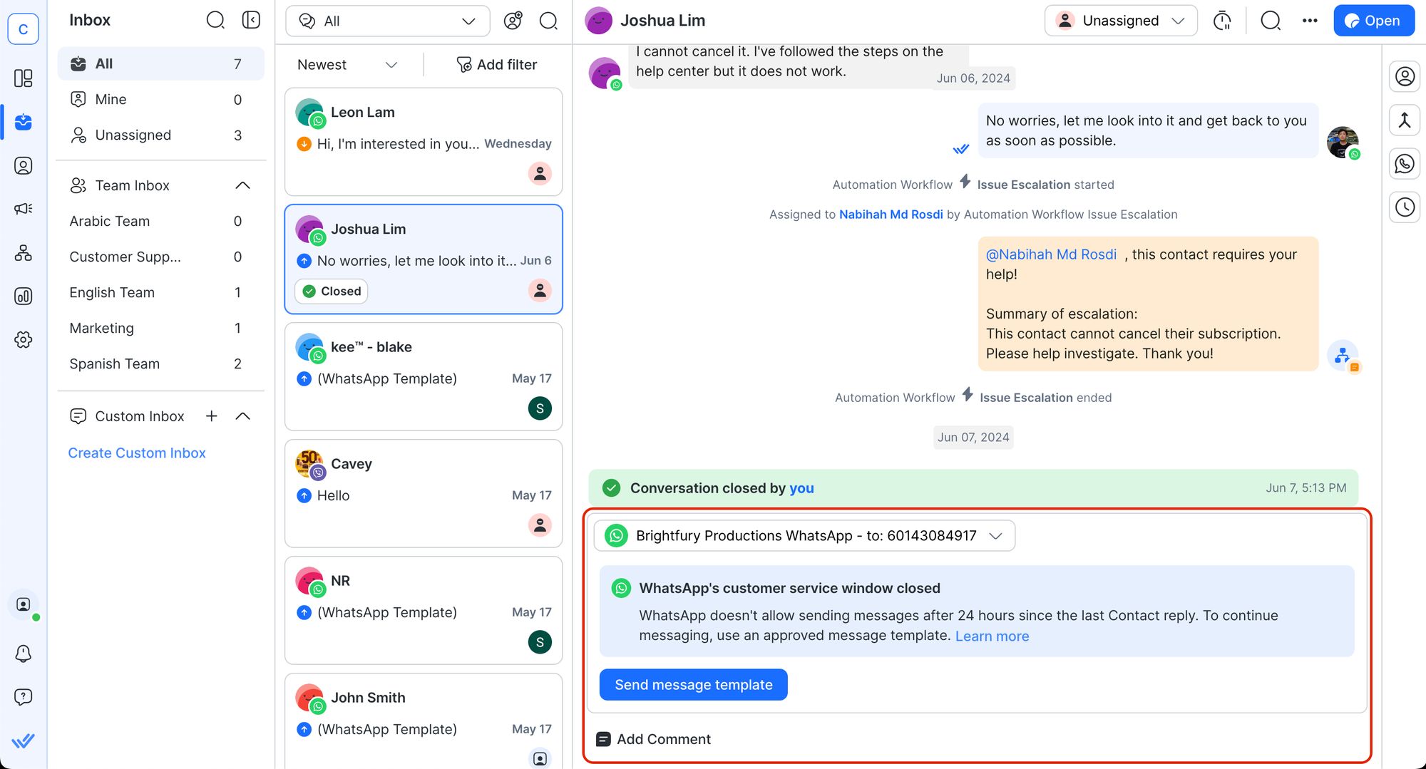
In the final stage of the update, we focused on simplifying contact management. The Contact Details Drawer has been improved with integrated tabs for Merge Suggestions and Channels, providing a more streamlined view.
You can now manage duplicates more efficiently, with detailed information provided during the merge process. Channels are also better organized, and a new Copy button next to all contact fields enhances quick information sharing.
Enjoy a Great User Experience with Respond 3.0
These updates are designed to provide a smoother, more intuitive experience, enabling quicker decisions and enhancing overall productivity. Shoutout to the customers who worked closely with us and provided valuable feedback, allowing us to design a great platform for real-world use.
With Respond 3.0 now fully up and running, we’re excited about what’s next! Be among the first to hear how we’re accelerating marketing and revenue generation opportunities over chat by following us on LinkedIn, Instagram or Facebook.
Turn customer conversations into business growth with respond.io. ✨
Manage calls, chats and emails in one place!


 Electronics
 Fashion & Apparel
 Furniture
 Jewelry and Watches

 Afterschool Activities
 Sport & Fitness
 Beauty Center
 Dental Clinic
 Medical Clinic
 Home Cleaning & Maid Services
 Photography & Videography
 Car Dealership
 Travel Agency & Tour Operator


