
Bonjour, konnichiwa and merhaba! 🙏 As respond.io continues to expand its international user base, we’re adding more languages to the platform — 15 of them in November, in fact. Before we go into detail about that, check out the total revamp we’ve done for the Contact Drawer.
The Redesigned Contact Drawer
We’ve redesigned the Contact Drawer to optimize your view and increase efficiency in accessing Contact information. 🎉 Here’s a rundown of the changes.
New Vertical Sidebar for the Contact Drawer
Originally, Contact Details, Activity and Channels were displayed as tabs within a permanent panel.
For easier navigation, the tabs are now repositioned in a persistent vertical sidebar to the right of the Messages Module. Clicking on any of the tabs will open the Contact Drawer for a wider display of the relevant contact information.
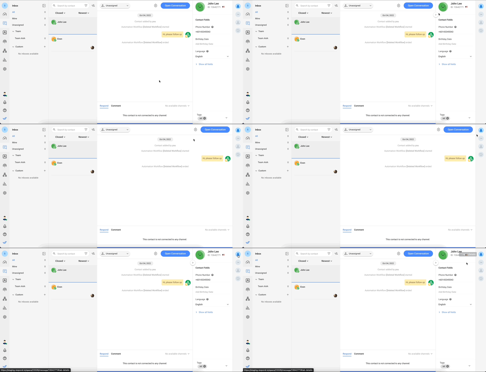
Additionally, the Contact Drawer is now collapsible! Hover over the drawer and click on the arrow button to collapse it. This will expand the Messaging Console and allow you to focus on conversations.
To reopen the Contact Drawer, simply click on any of the tabs in the Vertical Sidebar.
New Merge Suggestions Tab
Merge Suggestions was previously positioned at the bottom of the Channels section. There were no details provided about the Contact(s) with overlapping identifiers that prompted the merge suggestion.
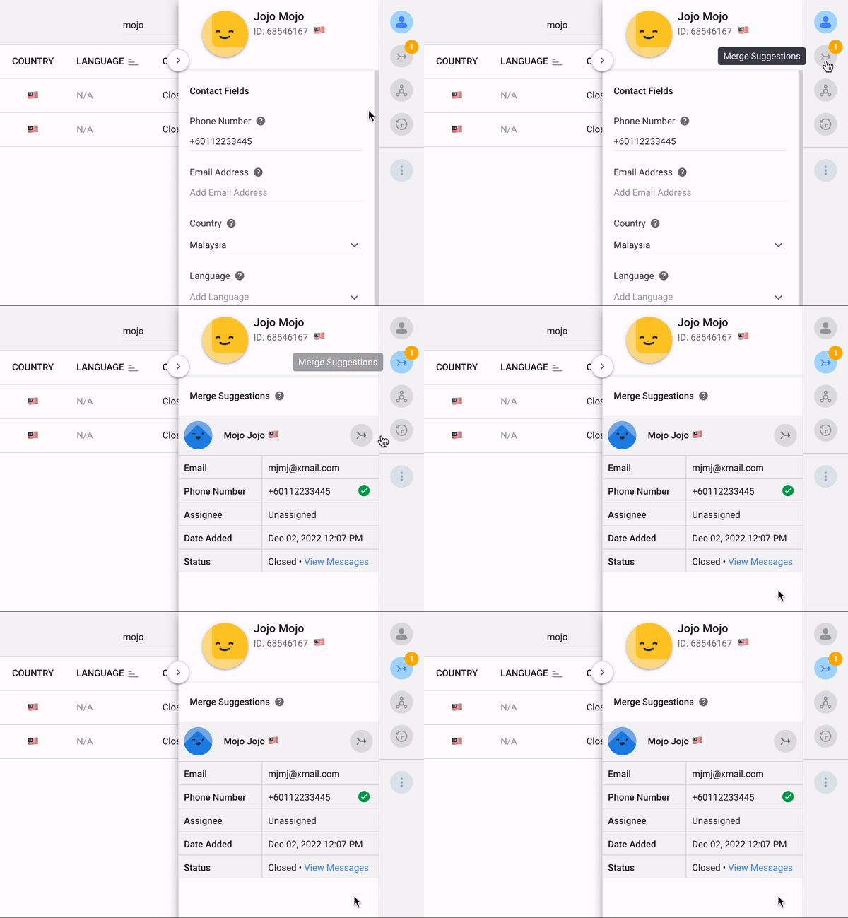
For improved Contact management, Merge Suggestions now has its own tab in the Vertical Sidebar. It provides key information like overlapping identifiers about potential duplicate Contacts when clicked on. This allows you to compare the details at a glance and decide if the merge suggestion is valid.
New Persistent Tags Field
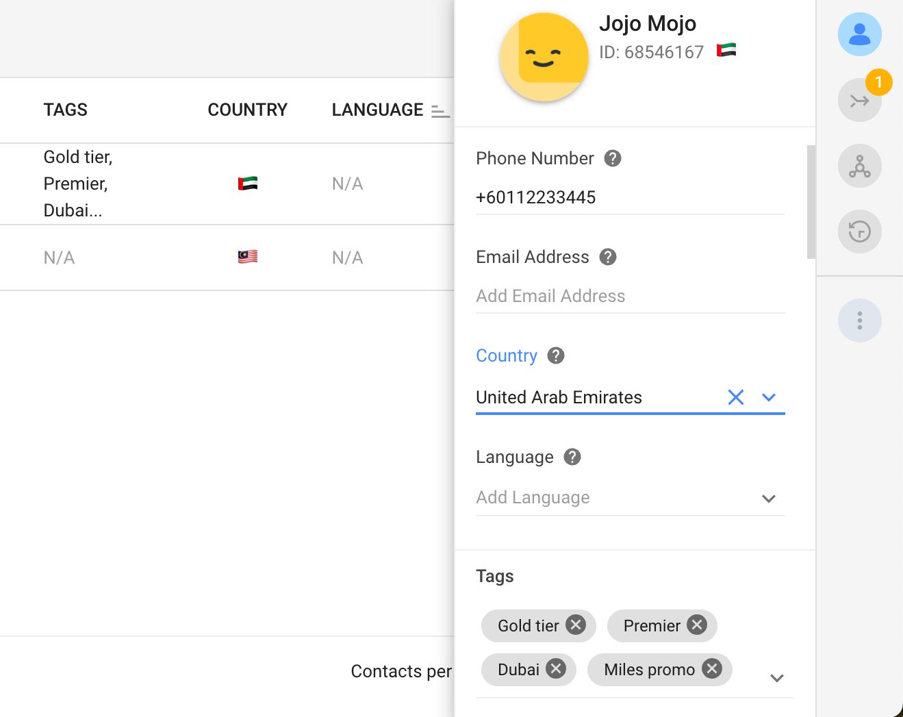
If you have numerous Contact Fields, you previously had to scroll all the way to the bottom of the Contact Details panel to view the Tags. The Tags field has been updated as a persistent section in the Contact Drawer so it will be pinned in position and is always visible for easy reference.
Customizable Contact Details View
You can now customize your Contact Details view by reconfiguring the order and adjusting the visibility of the Contact Fields. This tailors the Contact Details to your specific use so the most relevant information is easily accessible and all secondary information or noise is concealed.
In Settings > Workspace Settings > Contact Fields, click the Customize View button. Now you can reorder the fields or edit their visibility.
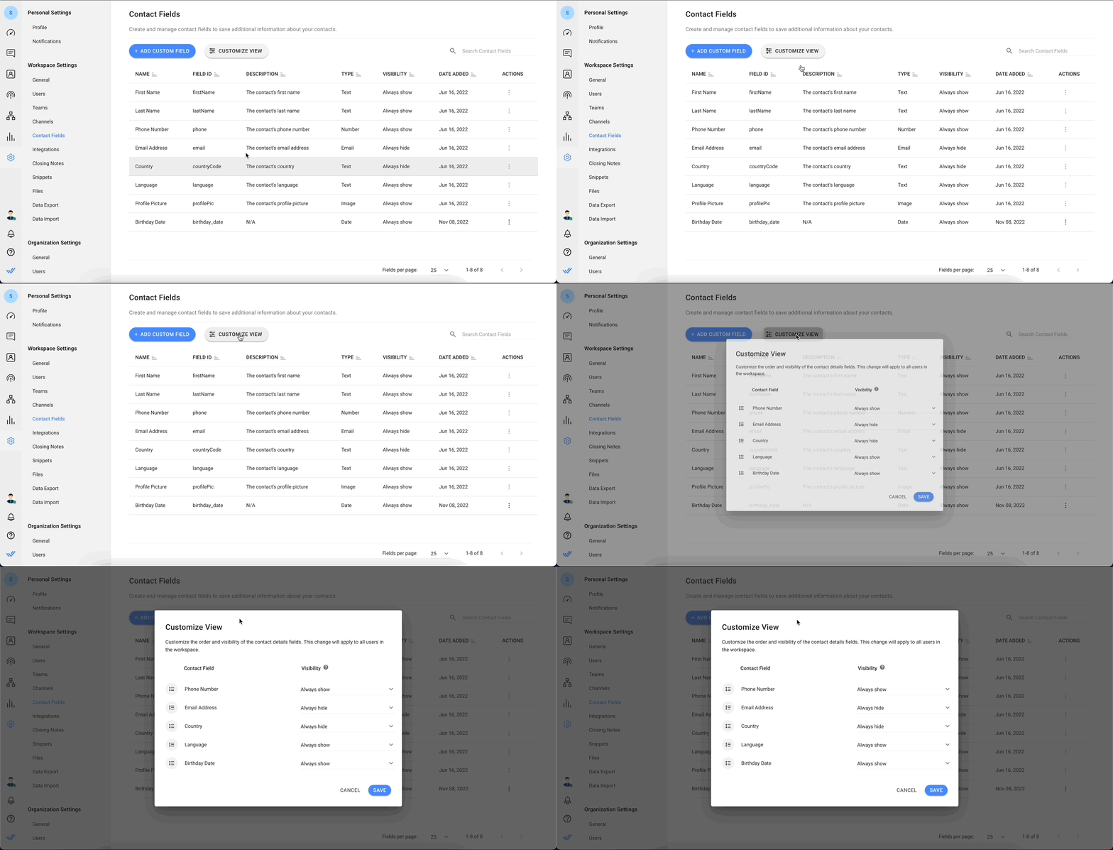
To reorder the fields in the Contact Details Drawer, drag and move them in the dialog to your desired order. Click the Save button when you’re done. The new arrangement will be reflected in the Contact Details Drawer for all Workspace users immediately.
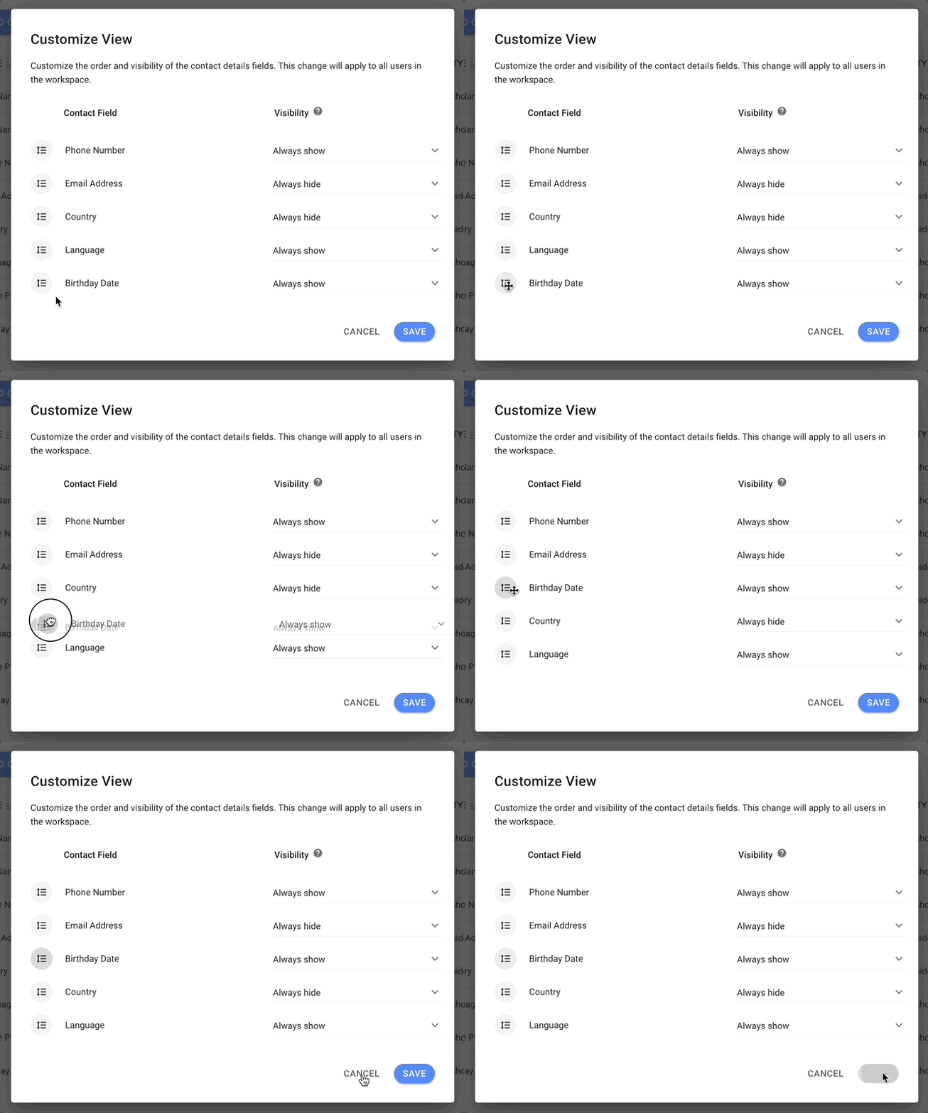
To display only relevant Contact Fields, you can manage the visibility of individual fields.
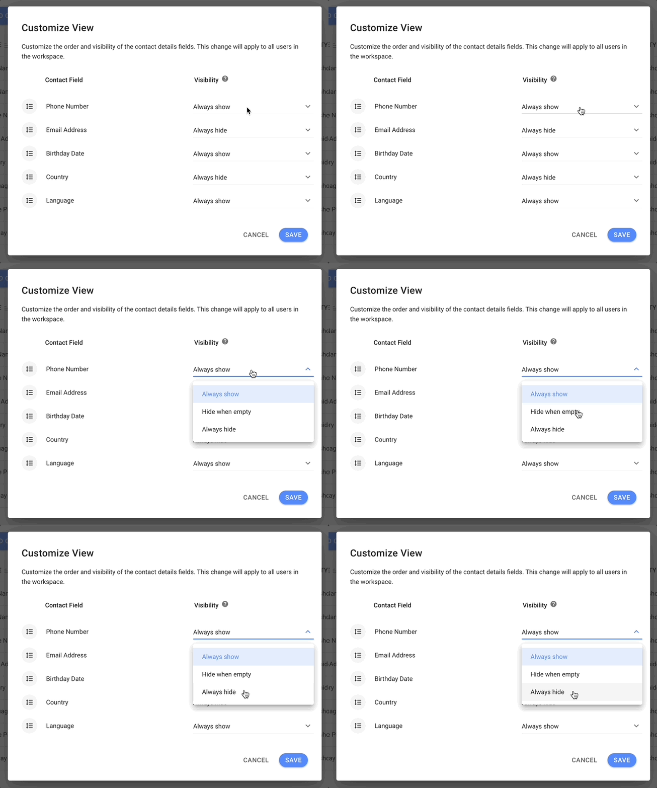
There are 3 options for Contact Fields visibility:
Always show: When this option is selected, the Contact Field will be displayed in the Contact Details Drawer.
Always hide: When this option is selected, the Contact Field will be hidden in the Contact Details Drawer.
Hide when empty: When this option is selected, the Contact Field will be hidden if its value is empty.
Once the changes are saved, the new visibility configuration will be reflected in the Contact Details Drawer for all Workspace users.
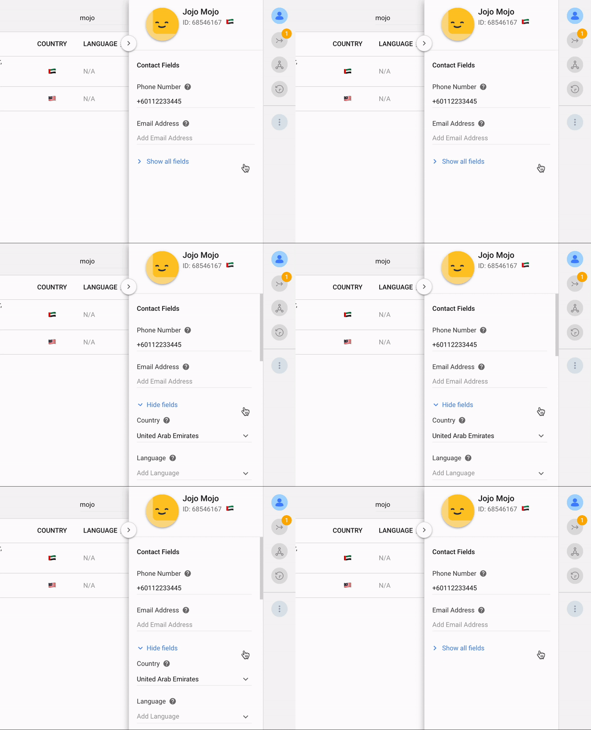
To view all hidden Contact Fields, click the Show all fields toggle in the drawer. You can hide them again by clicking on the Hide fields toggle.
Description Tooltip for Contact Fields
You can now create tooltips for Contact Field descriptions in the Contact Details Drawer. This provides users such as new agents information on the use and intended value types for this field when they hover over it.
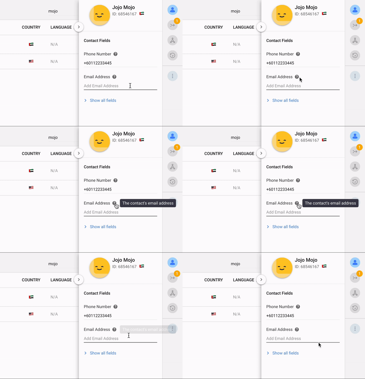
To create a description tooltip, go to Settings > Workspace Settings > Contact Fields and add a description to the relevant field. Click Update when done. The description tooltip will be shown in the Contact Details Drawer for all Workspace Users immediately.
Now, let’s go through the new platform languages.
Multiple languages now available on Respond.io
Start your workday with your preferred greeting, whether it’s สวัสดี, 你好, bonjour or привет among others! The respond.io platform is now available in these languages:
Arabic (اللغة العربية) 🇸🇦
Burmese (မြန်မာဘာသာ) 🇲🇲
Simplified Chinese (简体中文) 🇨🇳
Traditional Chinese (繁體中文) 🇹🇼
French (Français) 🇫🇷
German (Deutsch) 🇩🇪
Hebrew (עברית) 🇮🇱
Indonesian (Bahasa Indonesia) 🇮🇩
Italian (Italiano) 🇮🇹
Japanese (日本語) 🇯🇵
Korean (한국어) 🇰🇷
Russian (Русский) 🇷🇺
Thai (ภาษาไทย) 🇹🇭
Turkish (Türkçe) 🇹🇷
Vietnamese (Tiếng Việt) 🇻🇳
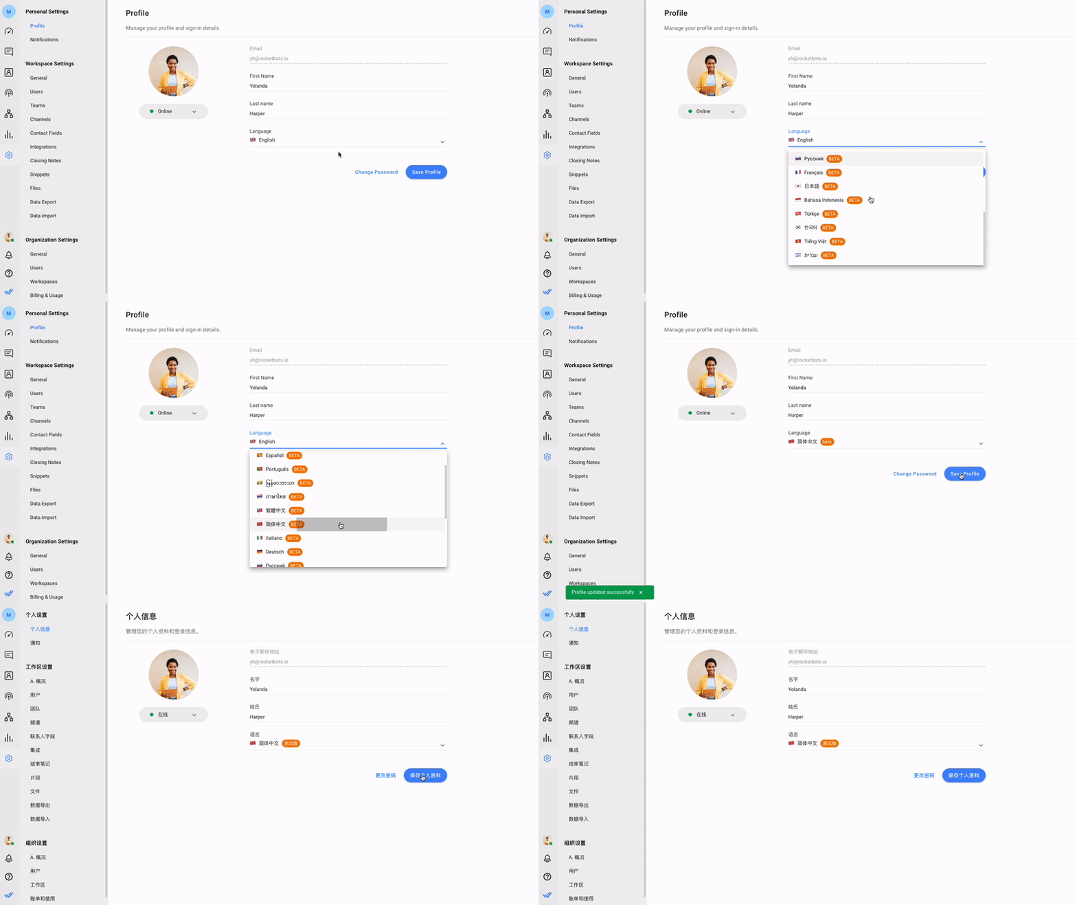
You can easily switch your platform language to any of these languages by going to Settings > Personal Settings > Profile > Language. New users can select their preferred language on the sign-up page before creating a respond.io account.
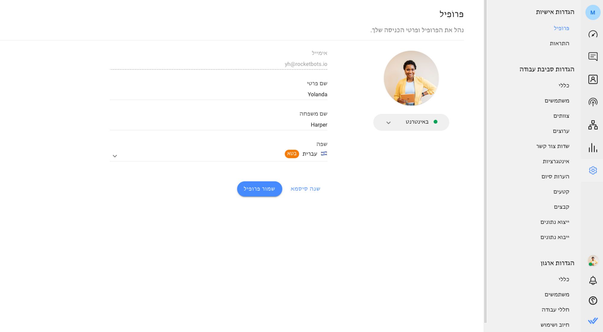
Choosing Arabic or Hebrew as your platform language will switch all platform interfaces to a Right-to-Left (RTL) view. This provides a more personalized and familiar view for Arabic and Hebrew-speaking users.
Arabic language users will also see all platform-related emails such as Monthly Active Contact (MAC) limit alerts and email invitations to new Workspace users in Arabic.
For all other languages, the language change is limited to platform use and won’t apply to emails yet. If you want to see these added soon, post a feature request here.
Turn customer conversations into business growth with respond.io. ✨
Manage calls, chats and emails in one place!


 Electronics
 Fashion & Apparel
 Furniture
 Jewelry and Watches

 Afterschool Activities
 Sport & Fitness
 Beauty Center
 Dental Clinic
 Medical Clinic
 Home Cleaning & Maid Services
 Photography & Videography
 Car Dealership
 Travel Agency & Tour Operator


